Suffusion Theme Advanced Responsive Settings post shows you how to add custom css code in the back-end to improve your sites responsiveness and more.
Last Updated: January 1, 2024
Latest News: I have edited the documentation below.
What You Need:
Suffusion Responsive Settings Tutorials:
- Responsive Settings
- Advanced Responsive Settings
Suffusion Theme Advanced Responsive Settings
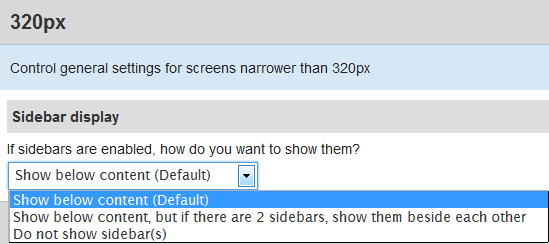
Step 1 ) The following image 320px allows you to set up the following options.
- Show below content (Default)
- Show below content, but if there are 2 sidebars, show them beside each other
- Do not show sidebars(s)
480px Settings
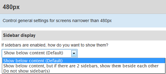
Step 2 ) The following image 480px allows you to set up the following options.
- Show below content (Default)
- Show below content, but if there are 2 sidebars, show them beside each other
- Do not show sidebars(s)
650px Settings
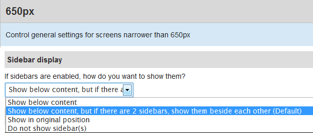
Step 3 ) The following image 650px allows you to set up the following options.
- Show below content
- Show below content, but if there are 2 sidebars, show them beside each other (Default)
- Do not show sidebars(s)
980px Settings
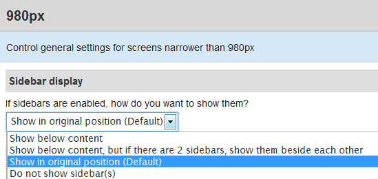
Step 4 ) The following image 980px allows you to set up the following options.
- Show below content
- Show below content, but if there are 2 sidebars, show them beside each other
- Show in original position (Default)
- Do not show sidebars(s)
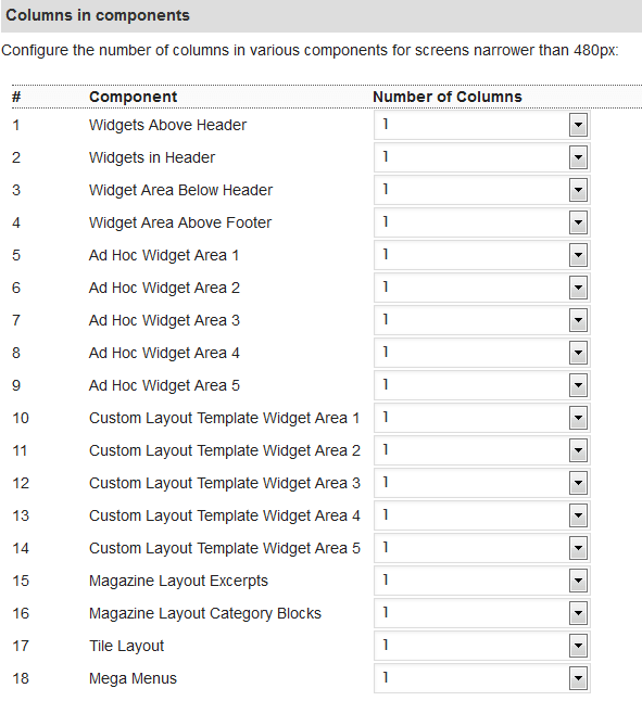
Columns In Components
Step 5 ) The following image allows you to set up the following (ONLY for 480px, 650px and 980px) display options.
- You can configure the changes for each Component and allow the Number of Columns to display
That is how simple it is to setup Suffusion to be responsive.
Suffusion Responsive Custom Settings
Step 6 ) There are a few more options that you need to take into consideration. You need to make sure that if you have added Google adsense, widgets, custom code or images you need to check them and make sure they are set to % instead of PX. For example 650px might represent 75%.
If you are using Firefox, there is a tool you might like to use under Tools -> Web Developer -> Responsive Design View. This tool allows you to view different responsive layouts that will help you check the website and see if there are any issues with different layouts. If you don’t see this tool then search for it in Add-ons. I run firebug and that helps me a lot.
The following custom code will allow you to force the theme to be responsive when viewed on a mobile device. To add custom code to the theme go to Appearance -> Suffusion Options -> Back-end -> Customs Includes -> Custom Styles.
Note: Your settings will be different to the settings below. Please make a note of this. Always review your changes before you save your settings and go live.
==============================================================
#nav-top, #top-bar-right-panel {
max-width: 1280px;
min-width: 0;
}
#wrapper{
max-width: 1280px;
min-width: 0;
}
#wpadminbar{width: 100%;min-width: 0;}
==============================================================
Code For Navigation Above Or Below The Header
If you are using the following Navigation Bar Above Header or Navigation Bar Below Header, (This also applies to the widgets). You might want to add the following css code in custom Style if you are experiencing problems when viewing your website in your mobile phone or Smartphone.
The following allows you to control all mobile devices with a screen size below 650px. You can change the 650px and add what ever value you think best suits your settings. In the example below I added the .tinynav class. I had an issue with a clients website navigation bar below header and the only way I was able to resolve it was by adding this little and simple code. If you are experiencing other issues then what ever you add in between @media will be applied.
@media screen and (max-width: 650px) {

.tinynav {

width: 100%;

}

}
==============================================================
Tablet Custom Code
The following code allows you to control how tablets will display the sidebar widgets.
In this example the sidebar widgets are on the left hand side. I was having problems with one of my websites. In portrait view for the following size 980px X 1280px it was pushing the sidebars to the very far left and did not display correctly. The sidebar was cut in half and could only view half of the sidebar. If you are experiencing issues similar to mine then implement this method will help you.Remember if you are using Firefox use the tool I mentioned above to view the different size screens.
I discovered this method from the following website Responsive Design Is. (All credit for my solution is given to this website responsivedesign.is)
@media only screen and (min-device-width : 980px) and (max-device-width : 1280px) and (orientation : portrait){

#sidebar, #sidebar-b, #sidebar-shell-1 {

width: 75%;

}

}
The best method to check if your website is responsive or not is by using a smartphone and a tablet. However most of you might not have either or only have one. If that is the case you can use the following methods to check your website for responsiveness functionality.
- iPhone 5
- iPhone 6
- iPhone 6+
- iPads
- iPad 3
- Samsung Galaxy S3
- Samsung Galaxy S4
- Samsung Galaxy S5
Checking Methods:
- Responsinator
- Firefox browser, click on Tools -> Web Developer -> Responsive Design View
- Google Chrome browser, click on the menu button on the top right hand corner. The button has 3 horizontal lines. Click on the button -> More tools -> Developer tools. You will see a menu on the top right hand side, click on the Toggle Device tool bar. It looks like two mobile devices. This will give you the option to view your website in all sorts of sizes.
====================================
I hope this has helped you with your responsive settings. If you have any questions please let me know.
Click on the following URL Layouts Tutorials for more layouts tutorials.
If you have any questions please let me know. I will be updating this from time to time. So keep coming back for the latest.
Enjoy.
More Suffusion Tutorials:
I am using the responsive options in Suffusion theme. Trying to get wordpress default gallery to display correctly on ipad. I have it set to display 7 columns and using @media to display 3 columns on ipad. This works well except there gaps in the display. Is there any way I can get the gallery to display correctly.
Hi Rhonda, thank you for your question. Can you get in contact through my contact form. Once I reply back can you share a screen capture and point to the gaps. The reason why I ask is because I don’t have an iPad but I can check through Firefox Web Developers tools.
Thank you