Suffusion Theme Responsive Settings post shows you how to easily configure the theme for mobile devices like phones and tablets.
Last Updated: January 1, 2024
Latest News: I updated the documentation below.
Important: There is a minor glitch with the responsive menu when you view your website in a mobile device. What is currently happening is the navigation menu displays a link to a page or post “depending on how you have set your navigation menu”. When you click on the navigation menu to display the page it does not refresh and it does not take you to the link already displayed.
There is a workaround for now until this gets fixed in a future release. What you can do is add a Home page link to your navigation menu. That means that when someone views your website on a mobile device, the navigation menu will default to Home link. So, when they click on the navigation menu and view the drop down and select another post or page it will redirect them to what ever they have selected.
What You Need:
Suffusion Responsive Settings Tutorial:
- Responsive Settings
- Advanced Responsive Settings
Suffusion Theme Responsive Settings
Step 1 ) The following is a list of steps that help you set up your site for mobile devices “Responsive”.
- Set your Layouts to be fluid. Go to Appearance -> Suffusion Options -> Layouts -> Default Sidebar Layout -> Fluid width settings. (This is the most common layout used. You might be using a different layout)
- Enable Responsive Layouts. Go to Appearance -> Suffusion Options -> Layouts -> Responsive Layouts. See step 3 ) below for more information.
- In some cases you might need to add custom code to help adjust and implement a nicer mobile display.
- You might have to change the settings for images, widgets, Google Adsense, text etc to % instead of PX where ever possible.
- If you are going to have a logo “Not as text but as an image” then you must upload the image as a “Header Foreground Image” and not as a “Header Background Image”. This will make it responsive. Remember to following the important note below.
Important:
If you are going to use an image instead of text for your Blog Title, you need to check the following option to make sure it is not set to hidden. Go to Other Graphical Elements -> Header -> Blog Title / Header Alignment and make sure it is not set to hidden. This controls the display of the “Blog Title” so if it is hidden then the image will not show. Remember that you are now using an image instead of a text Title.
You also need to add the following custom css code. This is important or else your image will overlap the header width when viewing on small devices.
Adding max-width with a percentage of 100% will force the image to be reduced in size depending on the browser display with different devices. For example desktop monitor, tablet, smartphone etc.
.blogtitle {

max-width: 100%;

}
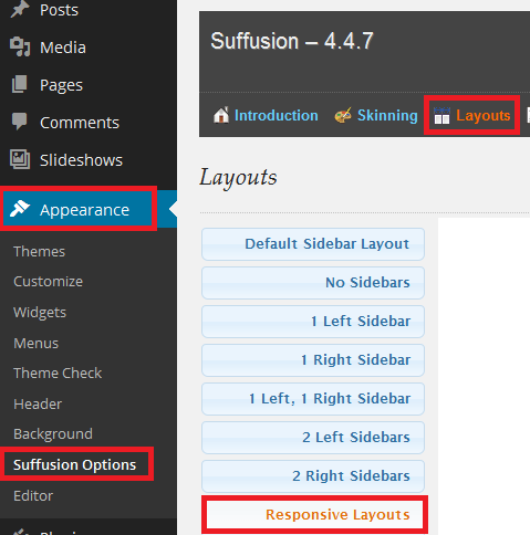
Step 2 ) Go to Appearance -> Suffusion Options -> Layouts -> Responsive Layouts as illustrated in the image below to set up your responsive settings.

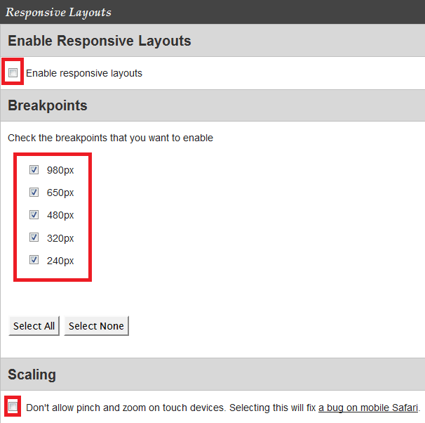
Step 3 ) The following image allows you to set up the following options.
Enable Responsive Layouts
- Enable responsive layouts
Breakpoints
- Check the breakpoints that you want to enable. You have the following options 980px, 650px, 480px, 320px and 240px.
Scaling
- Don’t allow pinch and zoom on touch devices. Selecting this will fix a bug on mobile Safari. (For all my websites and blogs I enable this option. It allows the theme to work well in Android and iOS devices)

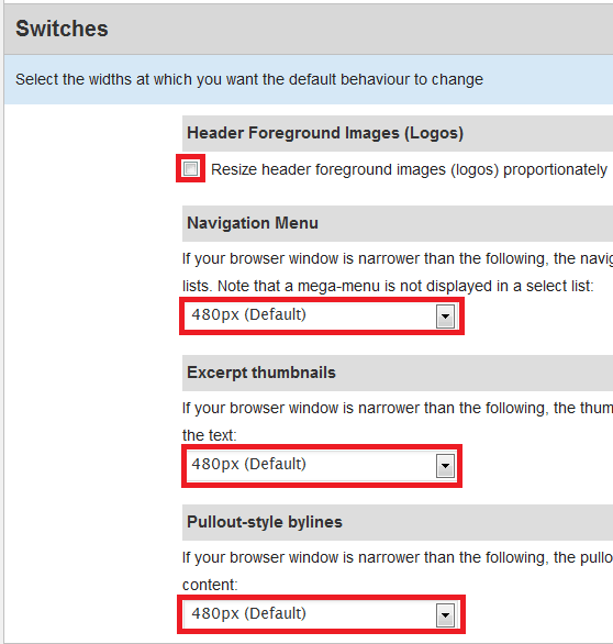
Step 4 ) The following image Switches allows you to set up the following options.
Header Foreground Images (Logos)
- Resize header foreground images (logos) proportionately (This option is very import to enable, if you don’t then the image will not rezise when viewing in smartphones or tablets. )
Navigation Menu
- If your browser window is narrower than the following, the navigation menus become “Select” lists. Note that a mega-menu is not displayed in a select list:
Excerpt thumbnails
- If your browser window is narrower than the following, the thumbnails in excerpts appear above the text:
Pullout-style bylines
- If your browser window is narrower than the following, the pullout-style bylines appear below the content:

Important Notice: I have left everything as default for each layout. You might want to change these settings in accordance to your design.
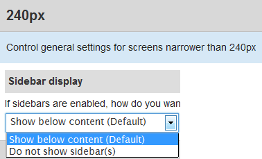
Step 5 ) The following image 240px allows you to set up the following options.
- Show below content (Default)
- Do not show sidebars(s)

Recommended Link:
- Click on the following URL Layouts Tutorials for more layouts tutorials.
========================
I hope this has helped you with your responsive settings.
Click on the following URL Advanced Responsive Settings to complete the next part of the tutorial.
If you have any questions please let me know. I will be updating this from time to time. So keep coming back for the latest.
Enjoy.
More Suffusion Tutorials:
Dear Manuel, thank you for your instructions! However, I do not succeed in uploading a responsive header. I have success in uploading a background header, but indeed it is not responsive. I loaded a foreground header in the Lay out settings, but no header is shown. In the Customizing area I even cannot upload a header at all, everytime I get an error after clicking on ‘crop’. Have tried everything I can find, but no solution. Hope you can help me.
Hi Wim, thank you for your question. Do you have the latest Suffusion version 4.4.8 installed? What WordPress version do you have installed? In the Skinning -> Header section did you also select Use a predefined image or logo for Header Foreground Image Type?
Hello Manuel, I sent my answer, but I don’t see it now, so I’ll send it another time: Suffion 4.4.8, WP 4.4., yes, predefinide image header foreground. When I do so, header stays empty. Via the option Header in Customizer I cannot upload header, shows error.
Hi Wim, make sure if you have a cache plugin you clear the cache. You also need to clear the browser cache. Anther area that you need to check is Other Graphical Elements -> Header -> Blog Title / Header Alignment and make sure it is not set to hidden.
Hello Manuel, I don’t understand it. I have no cache plugin, I cleared browser cache, in Other graphical elements Headers is on ‘show’ and still I got no foreground header grrr. Can’t you look for me into the site please?
Hi Wim, send me the login credentials via my contact form. I will take a look at your website.
Hello Manuel, I have a issue with a suffusion menu on mobile device even with a link to the main page in the menu. I would like to discuss if there is a workaround.
And thank you for the information, I was able to configure a responsive mode following your post.
Hello Sébastien, I checked your site in my mobile device and I cannot see your home page link in the menu. Please send me a message via my contact form and share with me the steps you took to add the home page link to the menu.
Thank you
Hi Manuel,
Thanks a lot for this great tuto on a great theme and thanks for what you’re doing for Suffusion. Hope it will last a few more years.
Thomas
You are most welcome Thomas. As far as I know at present Suffusion 5.7 works with WordPress 5.6.3, 5.7.1 and 5.8 Alpha. It also runs with PHP 7.3.x, PHP 7.4.x and PHP 8.
Kind regards