Change Twenty Twelve Theme Width post shows you how to adjust the theme width by changing a few values using css code and more.
Last Updated: July 15, 2019
Latest News: I added another tutorial to the list below.
Twenty Twelve width is a bit too narrow for my liking, so I decided to share this tutorial. In this tutorial I am going to show you how to make the theme width wider using Polished child theme. You need to make changes to two files. The style.css and the ie.css file located in the /css/ folder in Twenty Twelve parent theme. You can also customize more areas using the functions.php file if you want to properly adjust the width of the theme using the link below.
I use the following site voodoopress.com/modify-the-width-of-the-new-wordpress-twenty-twelve-theme/ as reference for this tutorial.
The following steps will show you how to achieve this.
Note: Make sure you have backed up the files you will be working with.
Twenty Twelve Tutorials:
- Customize Twenty Twelve WordPress Theme
- Add Copyright Notice
- Full Width Visual Editor
- Change Theme Width
- Display Featured Image
- Reference Post
Change Twenty Twelve Theme Width
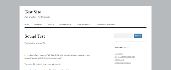
Step 1 ) The following image shows you the child theme width before making the changes and increasing the width.

Step 2 ) Open the style.css file in the parent and go to line 675 and then line 1528.
In line 675 you will find the following code. You only need to change max-width: 960px. Copy paste the whole code if you want or only the part that needs to be changed to the Polished child theme syle.css file.
Note: You might be using a different child theme.
/* Footer */
footer[role=”contentinfo”] {
border-top: 1px solid #ededed;
clear: both;
font-size: 12px;
font-size: 0.857142857rem;
line-height: 2;
max-width: 960px;
max-width: 68.571428571rem;
margin-top: 24px;
margin-top: 1.714285714rem;
margin-left: auto;
margin-right: auto;
padding: 24px 0;
padding: 1.714285714rem 0;
}
In line 1517 and line 1528 you will find the following code. You only need to make changes to max-width: 960px and max-width: 68.571428571rem;. Copy and paste the code to the Polished child theme style.css file.
/* Minimum width of 600 pixels. */
@media screen and (min-width: 600px) {
.site {
margin: 0 auto;
max-width: 960px;
max-width: 68.571428571rem;
overflow: hidden;
}}
Step 3 ) Open the ie.css file from the parent theme located in the /css/ folder and go to line 44. In line 44 you will find the following code. You only need to change max-width: 960px to suit your needs. First you need to create the same folder /css/ and copy ie.css file from the parent theme to the Polished child theme. You can delete the rest of the css code in the file if you like and only keep the changes you make.
Note: You might be using a different child theme.
.site {
box-shadow: 0 2px 6px rgba(100, 100, 100, 0.3);
margin: 48px auto;
max-width: 960px;
overflow: hidden;
padding: 0 40px;
}
Step 4 ) The following code is the end result. In this example the maximum width is set to 1200px width.
Note: The max-width: 85.714285714rem; is calculated as per the instructions mentioned in the referenced link above.
This code is added to the child theme style.css file.
/* This Block Adjusts the Overall Theme Width */
footer[role=”contentinfo”] {
max-width: 1200px;
max-width: 85.714285714rem;
}
/* Minimum width of 600 pixels. */
@media screen and (min-width: 600px) {
.site {
max-width: 1200px;
max-width: 85.714285714rem;
}
}
This code is added to the child theme ie.css file located inside /css/ folder.
.site {
max-width: 1200px;
}
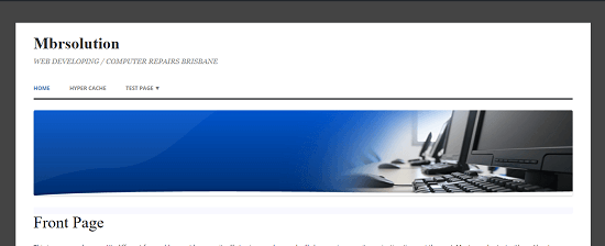
Step 5 ) The following image shows you the child theme width after making the changes and increasing the width. In this example you can see some changes to the background color and there is also a header image.

There are other areas that you might like to make changes too. Please refer to voodoopress link I shared above for more changes.
==============================
That is how simple it is to adjust the width for Polished child theme.
If you have any questions please let me know. I will be updating this tutorial from time to time.
Enjoy.