Fast Secure Contact Form Custom CSS Style Formatting shows you how to format a standard form CSS through the Style tab and much more.
Last Updated: July 30, 2017
The plugin controls the form design using different HTML DIV containers and applying custom CSS code. In this post you are going to learn more about styling the form using CSS.
Note: The following documentation requires a basic understanding of CSS and HTML. If you need to know more check the following URL W3Schools. This site has all you need to know about CSS, HTML and more. It even includes practical exercises to help you understand how the code works.
Fast Secure Contact Form Custom CSS Style Formatting Steps
Step 1 ) Go to Settings -> FS Contact Form -> Styles tab to edit the form style format.
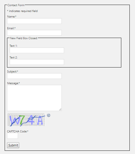
The Styles tab allows you to customize the style in different areas of the contact form. The image below displays a standard default form which is created when you install and activate the plugin for the first time. In this example a border has been added around the form to allow you to see the full contact form width.
Note: When you add a border around the form the following Title is also added Contact Form. If you have added an entry in Fieldset box label:
The following list shows you all the different CSS style tags you can customize to make changes to the design of the the form labels, field inputs, buttons, and text:. Each CSS style controls a different area of the form. All the fields in the list below with red text added next to the field controls a standard form. Any field with blue text added next to filed is optional for this tutorial.
Style of labels, field inputs, buttons, and text
- Required field indicator (Field used for standard form.)
- Required field text (Field used for standard form.)
- Hint messages
- Input validation messages
- Redirecting message
- Field Fieldset Box (Optional but used for this tutorial)
- Field labels (Field used for standard form.)
- Options labels
- Input text fields (Field used for standard form.)
- Input text field CAPTCHA (Field used for standard form.)
- Input textarea fields
- Input select fields
- Input checkbox fields
- Input radio fields
- Placeholder text
- Submit button (Field used for standard form.)
- Reset button
- vCita appointment button
- vCita appointment button DIV box
- “Powered by” message
- Enable aria-required tags for screen readers
Standard CSS Style Display
The following image shows you a standard form, plus a few extra fields. These extra fields are added to help you understand more about some of the extra CSS style formatting features available in the plugin. This form only has standard CSS style formatting added by default.
==============================
Required Field Indicator / Text
Step 2 ) The following image shows you the custom CSS styles settings for the following text and indicator in the form Required field indicator: and Required field text:.
Required field indicator: default settings
- text-align:left;
Required field text: default settings
- text-align:left;
Note: If you don’t want the above to be displayed in your form, check the following URL Fast Secure Contact Form Labels.

The following HTML source code in blue is controlled by the above fields.
<span style=”text-align:right;“>*</span>
and
<span style=”text-align:left;”>indicates required field</span>
==============================
Field Fieldset Box
Step 3 ) The following image shows you the custom CSS styles settings for the following Field Fieldset Box:.
Field Fieldset Box: default settings
- border:1px solid black; width:97%; max-width:500px; padding:10px;
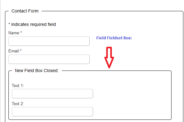
The following HTML source code in blue is controlled by the above field.
<fieldset id=”fscf_fieldset1_5″ style=”border:1px solid black; width:97%; max-width:500px; padding:10px;”>
<legend>New Field Box Closed:</legend>
<div id=”fscf_div_clear1_6″ style=”clear:both;”>
<div id=”fscf_div_clear1_7″ style=”clear:both;”>
<div style=”clear:both;”></div>
</fieldset>
==============================
Step 4 ) The following image shows you the custom CSS styles settings for the following Field Labels:.
Field Labels: default settings
- display:inline;

The following HTML source code in blue is controlled by the above field.
==============================
Input Text Fields
Step 4 ) The following image shows you the custom CSS styles settings for the following Input text fields:.
Input text fields: default settings
- text-align:left; margin:0; width:99%; max-width:250px;
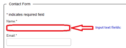
The following HTML source code in blue is controlled by the above field.
<input id=”fscf_field1_2“ style=”text-align:left; margin:0; width:99%; max-width:250px;“ name=”subject“ value=”” type=”text“>
==============================
Step 5 ) The following image shows you the custom CSS styles settings for the following Input text field CAPTCHA:.
Input text field CAPTCHA: default settings
- text-align:left; margin:0; width:50px;
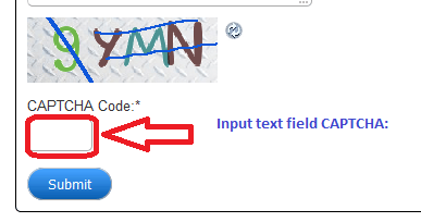
The following HTML source code in blue is controlled by the above field.
<input id=”fscf_captcha_code1“ style=”text-align:left; margin:0; width:50px;“ value=”” autocomplete=”off“ name=”captcha_code“ type=”text“>
==============================
Submit Button
Step 6 ) The following image shows you the custom CSS styles settings for the following Submit button:.
Submit button: default settings
- cursor:pointer; margin:0;
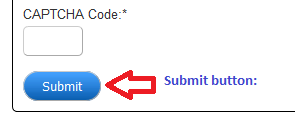
The following HTML source code in blue is controlled by the above field.
<input id=”fscf_submit1“ style=”cursor:pointer; margin:0;“ value=”Submit“ onclick=”this.disabled=true; this.value=’Submitting…’; this.form.submit();“ type=”submit“>
==============================
The above instructions provides a clear understanding on how to style a standard default form plus one added extra field is also included. This method applies to all your forms. Play around with the style settings until you get your desired design.
Note: The extra style fields not included in this tutorial are for certain fields when added in a form.
Click on the following link Troubleshooting to learn how to troubleshoot some of the most common issues.
If you have any questions please let me know.
Enjoy.