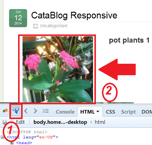
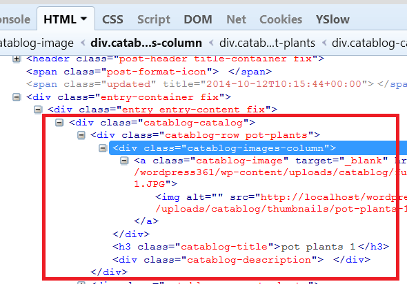
Note: There might be other code added depending on your theme and or your website set up.
CataBlog Class
- .catablog-row
- .catablog-images-column
- .catablog-image
- .catablog-row .catablog-images-column .catablog-image img
- .catablog-description
- .catablog-title
The following is an example of the CSS code you might see when following the method above. (Remember that in your website it will be different)
//////////////////////////////////
.catablog-row {
height: auto !important;
min-height: 300px;
width: 550px; <-----this is what you need to change
}
//////////////////////////////////
.catablog-images-column {
width: 250px; <-----this is what you need to change
}
//////////////////////////////////
.catablog-image {
width: 250px; <-----this is what you need to change
}
////////////////////////////////
.catablog-row .catablog-images-column .catablog-image img {
float: none;
max-height: none;
max-width: none; <-----this is what you need to change, this should have a percentage value.
min-height: 0;
min-width: 0;
}
///////////////////////////////
.catablog-description {
margin: 0 0 0 260px; <-----this is what you need to change
}
///////////////////////////////
.catablog-title {
margin: 0 0 0 260px !important; <-----this is what you need to change
}
////////////////////////////////////
The above CSS code has a pixel value and you need to change them to a percentage % value.
For example, find out what the width of the wrapper area is in your blog post or page. Then find out what the width is for CataBlog slideshow i.e. slideshow is 450px, this might equal to 55% of the overall wrapper width. You need to play around with these settings until you get the correct results.
(Remember there are other css codes like margins, borders etc)
The following setting width: 100%; can break your images when viewed on a wider screen. Instead use max-width: 100%;. That will create a maximum limit for your images on the screen, whether it is portrait or landscape.
If you have issues because of your theme or other elements in your website then add !important to every entry you add.
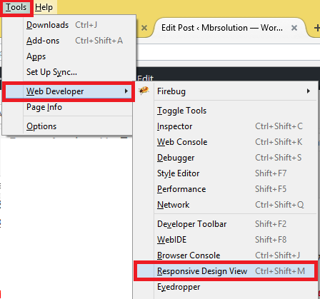
Step 5 ) The following image shows you a tool that Firefox has that allows you to view your website in different responsive layouts. This is a very handy tool to use when ever you need to test your design.

I hope this helps you create a responsive slideshow using CataBlog.
Click on the following URL Troubleshooting to continue.
If you have any questions please let me know. I will be updating this post from time to time. So make sure you come back to view any updates.
Enjoy.
CataBlog tutorials list:


