Last Updated: June 18, 2016
KompoZer Responsive Settings shows you how to setup your website to be responsive, this allows your website to be viewed on mobile devices like smartphones.
Latest News: I have added another link to the menu.
In this tutorial you will learn how to make your website responsive. This is very important nowadays. Most people worldwide are using either a tablet, smartphone or other mobile devices. So it is important to make sure your website keeps up with the trend. Another factor is that Google is making the responsive layout part of their ranking algorithm which is also important for SEO “Search Engine Optimization”. Part of the code in this tutorial was created using the following website Responsive Grid System.
KompoZer Responsive Settings Steps
Step 1 ) The following class is needed to create the grid type layout as mentioned in the URL above. Create the new class as shown below.
Note: There following class and @media “.group and @media only screen and (max-width: 480px)” are not added below. KompoZer does not recognize the code very well and it deletes the code when trying to insert the code. These two classes have been added to the following Link External Stylesheet tutorial.
Class Code Added:
.col:first-child {
  margin-left: 0;
}
.col {
  margin: 1%;
  display: block;
  float: left;
}
.group:before, .group:after {
  content: "";
  display: table;
}
.group:after {
  clear: both;
}
The above class needs to be added to the following div tags.
<div id=”wrapper” class=”group”>?
<div id=”leftmenu” class=”col”>
<div id=”mainbody” style=”text-align: center;” class=”col”>
<div id=”rightsidebar” style=”text-align: center;” class=”col”>
Note: If you need help with adding new class and assigning them to div tags please refer to the following URL KompoZer Left Menu Code.
Step 2 ) The following shows you the full CSS code for the website. Remember to include the new CSS class code from above. You will notice some changes to the code below from previous tutorials. This is needed to make sure the website responds correctly when viewed in mobile devices.
Full CSS Code:
#body {
width: 100%;
}
#wrapper {
margin: 0px auto;
padding: 0px;
clear: both;
width: 100%;
max-width: 1050px;
}
#header {
border-style: solid;
border-width: 1px;
background-color: #c0c0c0;
margin-right: auto;
margin-left: auto;
max-width: 1050px;
width: 100%;
display: block;
clear: both;
}
#leftmenu {
border-style: solid;
border-width: 1px;
background-color: silver;
width: 10%;
}
#leftmenustyle {
margin: 2px;
padding: 2px;
float: left;
}
#leftmenustyle ul {
margin: 0px;
padding: 0px;
list-style-type: none;
}
#leftmenustyle li {
display: inline;
}
#leftmenustyle a {
border-bottom: 1px solid #eeeeee;
padding: 1%;
background-color: #999999;
color: #ffffff;
text-decoration: none;
display: block;
font-size: 11pt;
font-weight: bolder;
width: 100%;
}
#leftmenustyle a:link {
color: #eeeeee;
text-decoration: none;
}
#leftmenustyle a:visited {
text-decoration: none;
color: #eeeeee;
}
#leftmenustyle a:hover {
color: #ffffff;
background-color: #00bee4;
}
#mainbody {
border-style: solid;
border-width: 1px;
width: 55%;
background-color: silver;
}
#rightsidebar {
border-style: solid;
border-width: 1px;
background-color: #c0c0c0;
width: 27%;
}
p {
text-align: left;
}
.rmenu {
width: 100%;
margin-right: auto;
margin-left: auto;
}
#titlestyle {
background-color: #000066;
text-align: center;
color: white;
width: 100%;
}
#rmenubox1 {
border: 1px solid black;
padding: 1% 0px;
background-color: #4e6799;
color: white;
width: 100%;
}
#rmenubox2 {
border: 1px solid black;
padding: 1% 0px;
color: black;
background-color: #ffccff;
width: 100%;
}
#rmenubox3 {
border: 1px solid black;
padding: 1% 0px;
background-color: #ffffcc;
color: black;
width: 100%;
}
#rmenubox4 {
padding: 1% 0px;
width: 100%;
}
#rmenubox5 {
padding: 1% 0px;
background-color: #ffffcc;
width: 100%;
color: black;
}
#photocontent {
margin: 0% auto 10px;
padding: 1px;
background-color: white;
text-align: center;
width: 100%;
}
#footer {
border-style: solid;
border-width: 1px;
width: 100%;
background-color: #c0c0c0;
margin-right: auto;
margin-left: auto;
clear: both;
display: block;
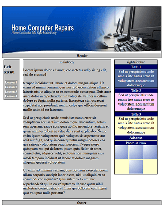
}Step 3 ) The following image displays the final website results. This will be converted into a template in a later lesson.
The Adsense is not showing in the image because I made changes to my Google Adsense account and was waiting for the adsense to be activated by Google.
Click on the following URL Link External Stylesheet to continue.
Go Back To KompoZer Tutorial List:
 I have been working in IT since 1999 and I enjoy the challenges it brings me. I love developing websites with WordPress. I spend a lot of time helping out in wordpress.org forums. I have been writing tutorials since 2011. Now I am learning how to manage my own VPS "Virtual Private Server.
Hi! Your page is excellent. I’ve been using Kompozer since 2000. Now Google says I must make a SEO. Is there a way to make a SEO with my old site, or your advice in this page is only for those who start with a new website? Thanks, Hallo.
Hello Hallo, can you provide more information in regards to the SEO question you are making? For example SEO covers a large area of web developing and online business. So if Google is asking you to improve your SEO that means that your site might not be following SEO standard rules. That can also penalize your site and rank you low.
Kind regards
I’m trying to convert my already existing desktop website to a responsive design. Now my problem is when I test whether it is mobile friendly or not through Google’s tester page, it tells me my “content is wider than the screen” I believe this problem is with the tables I created in Kompozer being too wide. I have been working and working and working on this and I feel like I am getting no where.
Hi James, when it comes to responsive it can be very tricky using Kompozer. The reason being is that Kompozer is not designed to be responsive and it has not been updated in a long time. Try and following my instructions and remember to use the external CSS file to include @media settings.
Nowadays I encourage people to move to use CMS “Content Management System” like WordPress for online development and still use Kompozer for learning HTML and CSS which is still a great tool for learning.
Let me know if you need more help or information.
Kind regards
You are absolutely right. WordPress is excellent, but there is a major problem. It very often get attacked by Malware and Trojans. Everytime I run Google Ads on my website, Google disable the Ads and inform me that the site has Malware links and the Ads cannot be run. The I do all sorts of cleaning and have installed all sorts of security plugins, but still its the same story. Any sggestion by you will be most helpful please! Thanks and regads
Hi Tissy,
The following should help you maintain a safe and secure WordPress site. Of course there are other measures you can take as well but these steps will get you started. You need to make sure your theme, plugins, WordPress version and Server are always up to date. Install a good security plugin and monitor your site regularly.
Kind regards